|
By: Johana M. Caba, M.A.
Graphic Design is at the core of many of our favorite brands! From the logo to the ad graphics to the promotional videos, everything needs to be in unison. And, the one marker that helps us immediately recognize a brand we love is the centerpiece, the logo. In this post, we will go over some of my graphic design tips for designing your own logo for your small business, influencer brand, and blog. You don't have to be a designer to design something amazing if you follow tips from the pros.
You can design your logo on any platform that you feel comfortable using. This can be Adobe InDesign, Canva, Visme, and any other graphic design platform that you want to use. So, let's get into these 5 tips:
1. Font Styles: There is an anatomy to typography. Different parts of letters signify different things. We will not get into this because it is a post all on its own, but there are certain markers on letters that help us distinguish between fonts. The Serif fonts are distinct because they are the oldest font styles we know since the printing press was created. Some of these fonts include Times New Roman, Baskerville, Didot and Archer. The Sans Serif fonts came after and they don't have the same accent markers that the serif fonts have. What do I mean with this? Well, if you look at a typical serif font, you can tell that it has certain ears, tails and loops that make each letter distinct from any of the other two font styles. When we look at a sans serif font, we don't see the typical loops on lower case letter g or the distinct old-fashion lower case letter p. And, the third style is the script or cursive style of font. This is a more illustrative and creative type of font. When selecting font styles for our logos we need to decide which style fits best with our brand. For example, if we are a young, modern and hip brand we might select sans serif fonts like atrament or script fonts like coquette and artifact. Likewise, if we are going for a dark and moody feel we might go with antique olive nord d or cubano fonts. To go a step further, some approachable fonts will include archer pro and avance pro while some high-end fonts include azo sans black and bodoni 72. Just think about the typical fonts we see with brands we love like Nike, Adidas, Azos and Zara. Below is a quick Canva font styles guide to help you when selecting your distinct font: 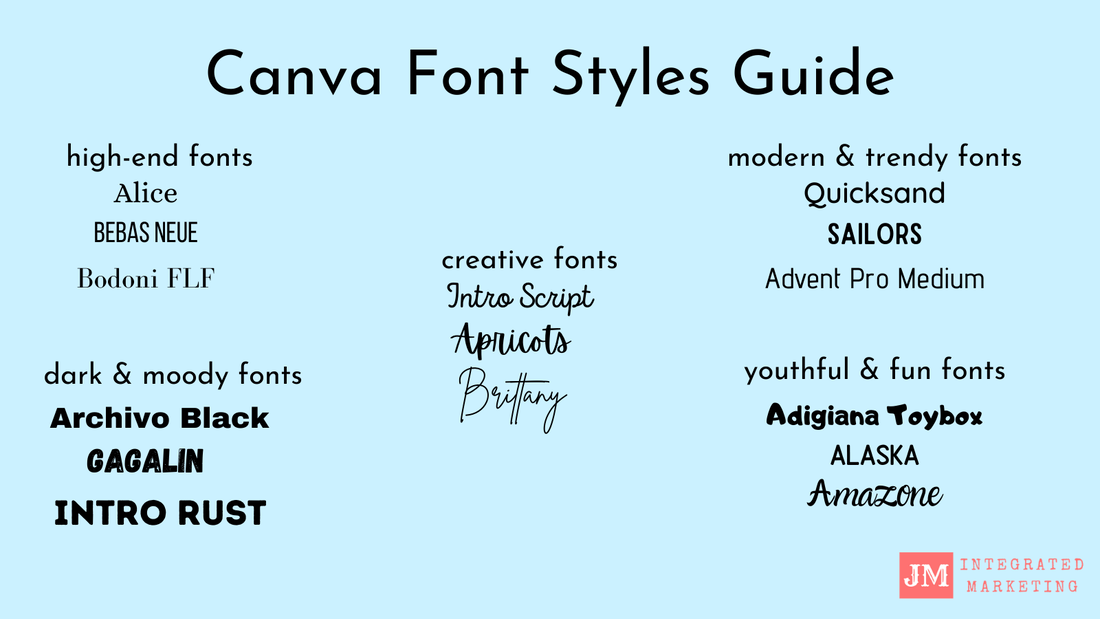
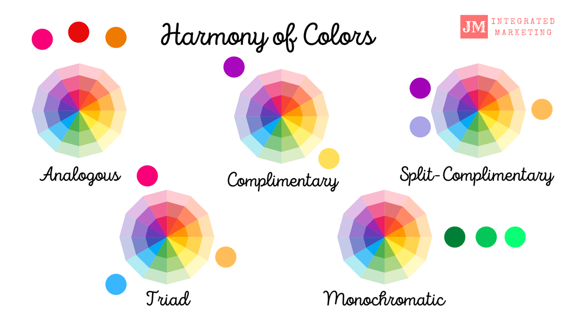
2. Harmony of Colors: The psychology of color refers to the ways in which we see colors, how they make us feel, what memories they bring up and how they affect the way we think. First, we will discuss the harmony of colors. For graphic design, color is very important, so we need to understand color itself. The primary colors we know are blue, red and yellow. Secondary colors are orange, green and violet. From there, we can create different hues, tints, shades and tones to get the colors we want. We also need to understand the harmony between colors to create color palettes for the logos we are making. There are analogous colors which are next to each other in a color wheel, complementary colors which are opposites to each other, semi-complementary, triad and monochromatic colors as well. Split-complementary colors are defined as color schemes that use one base color and two secondary colors. On the color wheel, you can see this with the secondary colors being placed symmetrically around the base color. Triad is a color scheme that is a special variant of split-complimentary colors, but this time they are equal distances from each other on the color wheel. Monochromatic colors are different shades, tones and tints of the same hue. See the examples below for the differences in color and visit Adobe Color for more popular color combinations and palettes.
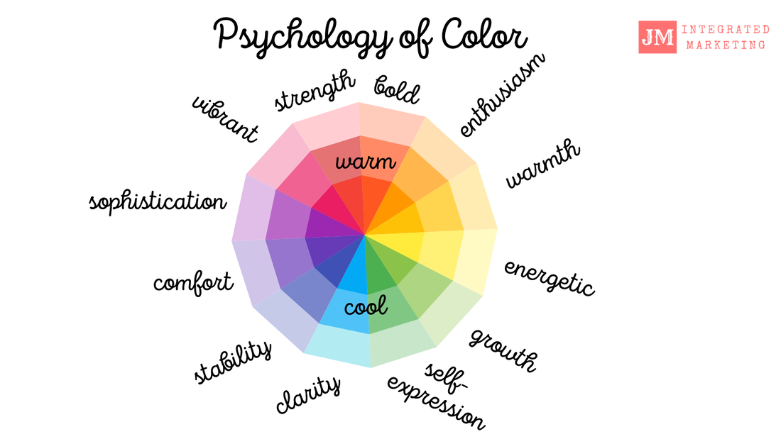
3. Psychology of Color: Like we discussed in the previous tip, the psychology of color refers to the ways in which we see colors, how they make us feel, what memories they bring up and how they affect the way we think. By understanding color, we can decide on how we want our audience/customers to feel when they see our brand. Of course, you can select your favorite colors, but it is good to have some idea of what these colors signify before finalizing our logos. For example, if we want our audience to think of our brand as a happy brand, we will use yellow and orange colors. Likewise, if we want our brand to stand for being vibrant and romantic, we will use shades and tones of pink. Think about why most sustainability brands and organic brands use the color green. The color green makes us think of words like growth, natural, organic and peaceful. So, it makes sense to use green in the logos and graphics of sustainability and organic brands. See the chart below for some more colors and for what purposes you can use them. Remember, to use this as a guide to help you when designing your logo.
4. Consistent Spacing: When it comes to branding, you can use grids if you are using InDesign to help you with ensuring that materials have consistent spacing throughout. You can always check on other platforms like Canva if your spacing is consistent by making sure everything looks equally spaced. When it comes to spacing between letters, this is called kerning. For example, Canva has a spacing tool that lets you select and experiment between different letter and line spacings to determine which space lengths work best. Click the link for a great kerning explanation from Canva. Spacing and grids can also help with the placement of different elements and texts in different materials. You can use this for posters, flyers, invitations and even product designs like a bottle of lotion or a candy bar.
5. The Golden Ratio of the Spiral: The spiral is a graphic design term that in geometry stands for a plane curve generated by a point moving around a fixed point while constantly receding from or approaching it. The point is that the fixed point is the center of your design (not necessarily the actual center). In graphic design, the fixed point is the attention grabber, it is where our eyes focus when looking at any particular design like a logo. From there, the less important elements are placed around that fixed point. In essence, this is the golden ratio which is a scientifically-proven number that makes something aesthetically pleasing in a deep level within our brains. The golden ratio gives us a specific number to use to structure designs. How do you find these numbers? Well, you multiply the size of any element by 1.618 to get what the size of another element should be. We see this in typography on posters and flyers all the time with the largest text being the headline or what we want people to see immediately. For a more in-depth explanation of the Golden Ratio, click the 99 Designs link.
I really hope that these 5 tips are helpful to you when creating your unique logo. You can use these tips when designing anything. And, if you need more help feel free to reach out to me by email, Twitter, LinkedIn or comment below.
35 Comments
Johana
10/5/2020 09:48:59 am
I'm so happy that you found this information helpful!
Johana
10/5/2020 09:49:18 am
Thank you so much! 10/4/2020 09:20:09 am
A very helpful post! I love the detailed explanations and visuals. Thanks for sharing.
Johana
10/5/2020 09:49:49 am
Thank you, I really wanted to provide examples to demonstrate what I was talking about! 10/4/2020 09:52:52 am
I can’t believe just when I was planning to design a logo for my blog, you shared this post with fantastic tips. I am saving this post for reference.😊
Johana
10/5/2020 09:50:11 am
I'm so happy it helped! Thank you for reading!
Johana
10/5/2020 09:50:25 am
Thank you! 10/4/2020 11:42:59 am
This was such a great read! It really puts it into concrete words what we've been thinking and seeing whenever trying to design things! Now we know how to describe what we want when people ask!
Johana
10/5/2020 09:50:49 am
Thank you for reading! I have always been completely fascinated with the concept of colour psychology. It's interesting how different colours trigger different responses and we don't even necessarily notice it. Honestly, I think it was one of my favourite studies while I was working on my marketing diploma.
Johana
10/6/2020 07:33:13 am
Hi Britt, 10/8/2020 11:24:30 pm
Thanks for the tips! I feel like design is definitely one of my weak points. I haven't really got the eye for it.
Johana
10/22/2020 11:13:48 am
Thanks for reading! I'm sure you do have the eye for it you just need a little practice and some tips!
Charity
10/9/2020 07:28:51 am
These are all such great ideas and tips for when you are designing a logo for your brand or business. Thanks so much for sharing.
Johana
10/22/2020 11:14:49 am
Thanks! I know a lot of people are inclined to start their own businesses and brands, and I wrote this with them in mind! This is some great information! I have always found other people to design a logo for me but now that my blog (desperately) needs a face lift, I have been looking into doing it myself, and now that I'm trying myself, I am realizing how clueless I am! So thanks for the tips!
Johana
10/22/2020 11:15:16 am
Thanks for reading! I'm glad you found this helpful!
Johana
12/2/2020 07:28:16 am
I'm so glad it helped! 11/26/2020 08:30:54 am
I love this post it has been so helpful. I have been trying to make a logo for my site for a while now and was starting to give up and was thinking of paying someone to make one for me. This post has really helped me so I am off to Canva to give it another go.
Johana
12/2/2020 07:28:56 am
Give it a try with these tips and if you need any help I'm happy to provide feedback. 12/1/2020 06:18:02 am
Very detailed and helpful post. We refer to this post next time for logo of some new venture.
Johana
12/2/2020 07:29:20 am
Thanks you! 12/1/2020 08:06:25 am
Great post! There is so much information here. I really love the harmony and psychology of colour. Colour can have such a profound influence on us. It is helpful to know how to use it effectively.
Johana
12/2/2020 07:29:37 am
Thank you so much for reading! 12/1/2020 08:25:58 pm
It's a great post. You are right; logo is very important for any brand, and you have explained simply and skillfully how to do this. I have learned a lot. Thanks for sharing such a great idea, moreover making it simpler.
Johana
12/2/2020 07:30:11 am
Thank you so much for reading and thanks for the feedback! I worked really hard on this post and it's one of my favorites. 9/20/2022 03:37:34 pm
I didn't know that there were so many design sites that could help with logos. I need a new logo for the office. I'll have to hire someone to create the logo for me.
Jessica
11/20/2023 11:13:27 pm
Be quick! Don't waste your time get grab these ❤❤ amazing vouchers <a href=" https://coupondonor.com/coupons/adulttime ">Learn more</a>
alina
12/18/2023 10:47:10 pm
Spread your life enjoyment through unique vouchers at <a href=" https://coupondonor.com/coupons/devilsfilm Leave a Reply. |
Categories
All
Disclaimer: We are a participant in the Amazon Services LLC Associates Program, Adobe Affiliate Program, and in the Canva Affiliate Program, these are affiliate advertising programs designed to provide a means for us to earn fees by linking to Amazon.com, Canva.com and affiliated sites. 
Get the Free Guide
Privacy Policy |
 RSS Feed